A product does not need a model, a busy location, or a large production set to make an impression. The strongest still life advertising examples prove that a carefully arranged product image can communicate quality, appetite, atmosphere, and value in one glance. For a growing brand, that is not just an aesthetic advantage. It is a sales advantage.
Still life photography gives you control over every visual decision: lighting, surface, color, props, angles, negative space, and the emotional signal surrounding your product. It can make a small skincare bottle feel luxurious, a local food item feel irresistible, or a new beverage feel ready for a national campaign. The goal is not simply to photograph what you sell. It is to show customers why they should want it.
What Makes Still Life Advertising Work?
Commercial still life images are designed with a job in mind. They may need to stop a social media scroll, support an ecommerce listing, fill a menu panel, announce a seasonal release, or give a new brand a recognizable visual language.
The best results balance creativity with clarity. If an image is beautiful but hides the label, confuses the product size, or distracts from the main offer, it may not perform well where customers are making decisions. On the other hand, a plain product image can build trust but may lack the energy needed for a launch campaign. Most brands need both: clean, informative assets and more expressive campaign photography.
Here are 10 still life advertising examples that show how different visual approaches can support different business goals.
1. The Hero Product on a Bold Color Background
A single product placed against a saturated background is one of the most recognizable approaches in advertising. Think of a bright drink bottle against cobalt blue, a coral-colored skincare tube on soft pink, or a premium snack package against a sharp yellow field.
This style is effective because it is immediate. The product becomes the visual focal point, while the background can reinforce your brand palette or campaign theme. It works especially well for paid social ads, website banners, launch announcements, and retail displays.
The trade-off is that bold color requires restraint. If the label already contains several colors, the background must support it rather than compete with it. A commercial photographer will often test tones that make the packaging stand out while preserving accurate product color.
2. The Floating Product Composition
Floating still life photography creates movement without showing a person. A can appears suspended above a splash, ingredients hover around a sauce jar, or a beauty product seems to rise from a cloud of powder.
For brands with a playful, modern, or innovative personality, this approach can create instant scroll-stopping energy. It is particularly strong for social campaigns, product launches, and digital ads where you have only seconds to earn attention.
This is a more technical production style than it looks. The final image may involve precise prop support, multiple captures, retouching, and careful shadow work. It is worth the investment when the campaign needs a memorable central visual, but it may be unnecessary for routine catalog imagery.
3. Food Photography That Shows the Moment Before the Bite
For cafés, restaurants, bakeries, and food brands, a still life scene can sell flavor before anyone takes a bite. A fresh pastry with scattered crumbs, a burger with a lifted top bun, or a cold drink with condensation can create a sensory response that a plain overhead shot may not.
The key is controlled imperfection. A few crumbs, a folded napkin, or a knife with a trace of sauce can make food feel real and inviting. Too much styling, however, can make the image feel staged or messy.
This is one of the most practical still life advertising examples for hospitality businesses because the same shoot can deliver menu photography, delivery platform images, website visuals, table tents, and weeks of social media content. For Caribbean hospitality brands, natural textures, tropical ingredients, and vibrant local color can add a strong sense of place without overwhelming the dish.
4. The Ingredient Story
An ingredient-led composition places the finished product beside the elements that give it character. A coffee bag may sit among roasted beans and a ceramic cup. A hot sauce bottle may be framed by fresh peppers, garlic, and herbs. A body scrub can be photographed with the botanicals or oils it contains.
This approach helps customers understand the product quickly. It can communicate freshness, origin, flavor, craftsmanship, or clean formulation without relying on long copy.
Use ingredients that are genuinely relevant. If a fragrance contains citrus notes, citrus can support the story. If a product is made locally, materials connected to that origin may help. Random props can make an image look attractive, but relevant props make it persuasive.
5. The Premium Texture Shot
Luxury is often communicated through texture. Glass reflections, creamy shadows, matte paper, polished metal, linen, stone, water droplets, and soft fabric all influence how a product is perceived.
A premium texture composition may show a perfume bottle on dark stone, jewelry against silk, or a high-end candle surrounded by sculptural shadows. The product remains clear, but the setting gives it a higher perceived value.
This does not mean every brand needs dark, dramatic imagery. Premium can also feel bright, warm, minimal, or playful. The important question is whether the materials and lighting reflect the price point and promise of your product.
6. The Everyday Lifestyle Still Life
Lifestyle photography does not always require people. A breakfast spread on a sunny table, a travel kit on a hotel bed, or a wellness product beside a towel and book can show how a customer might use the item in real life.
This style is useful when context matters. A reusable bottle is more compelling when shown ready for a workout. A local snack becomes more appealing when placed in a picnic scene. A tableware collection gains value when it helps customers imagine hosting with it.
Keep the scene focused. Every item in the frame should answer a question about the product, the customer, or the occasion. If it does not, remove it.
7. The Before-and-After Pairing
Some products sell best when they demonstrate a visible change. Cleaning products, beauty products, repair services, meal kits, and organization tools can benefit from a before-and-after concept.
Still life makes this format easier to control. You can create two matching compositions with the same lighting and camera angle, then let the difference do the selling. For example, a stained surface and a polished surface, an unorganized desk and a refined workspace, or raw ingredients beside the finished meal.
Honesty matters here. The transformation should be credible and clearly connected to the product's real benefit. Overpromising can weaken trust, even when the image attracts attention.
8. The Seasonal Limited-Edition Scene
Seasonal campaigns give customers a reason to notice products they may have seen before. A familiar beverage can feel new with holiday styling, a gift box can become a Valentine’s offer, and a restaurant dish can take on fresh appeal through a summer table setting.
The strongest seasonal still lifes use a few deliberate signals rather than every possible decoration. A warm color shift, a specific flower, textured wrapping, or a seasonal ingredient may be enough. Overstyling can make the product disappear into the theme.
Plan these campaigns early. A set of seasonal assets can support email promotions, stories, ads, printed materials, and website updates long after the shoot day ends.
9. The Product Collection Grid
When you offer multiple flavors, colors, sizes, or related products, a structured collection image can communicate range and consistency. Products may be arranged in a grid, a color gradient, or a clean repeating pattern.
This visual approach is especially effective for ecommerce category pages, wholesale presentations, and social carousels. It reassures customers that your brand is organized, established, and easy to shop.
Consistency is the point. Match the product heights, spacing, lighting direction, and label orientation as closely as possible. A collection image should feel intentional, not like several individual product shots placed together at the last minute.
10. The Campaign Image With Space for Copy
Not every photo needs to fill the entire frame. In fact, one of the most useful advertising images intentionally leaves negative space for a headline, price, offer, or call to action.
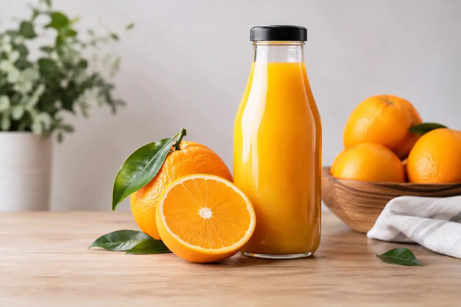
A bottle placed on the right side of a clean background gives a designer room to add campaign text on the left. A food dish positioned low in the frame can leave space for a restaurant promotion above it. This simple planning decision makes an image more flexible across ads, flyers, banners, and web layouts.
At Elton Browne Photography, commercial shoots are planned around how images will be used, not just how they will look on the day. That conversation can prevent a common mistake: receiving beautiful photos that do not fit the campaign formats your business actually needs.
How to Choose the Right Still Life Direction
Start with the decision you want your customer to make. If you need them to recognize the product, prioritize clear hero images. If you need them to crave it, use appetite, texture, and ingredients. If you need them to understand why it is different, build a visual story around the product benefit.
Also consider where the images will live. Ecommerce needs detail and consistency. Social media rewards energy and variety. A menu needs accuracy and appetite. A large print campaign needs resolution, clean composition, and room for design elements. One focused shoot can produce assets for all of these uses when the plan is set before the camera comes out.
The right still life image gives your product a role beyond sitting on a shelf. It helps customers picture it in their hands, on their table, in their routine, or at the center of the moment they want to create.